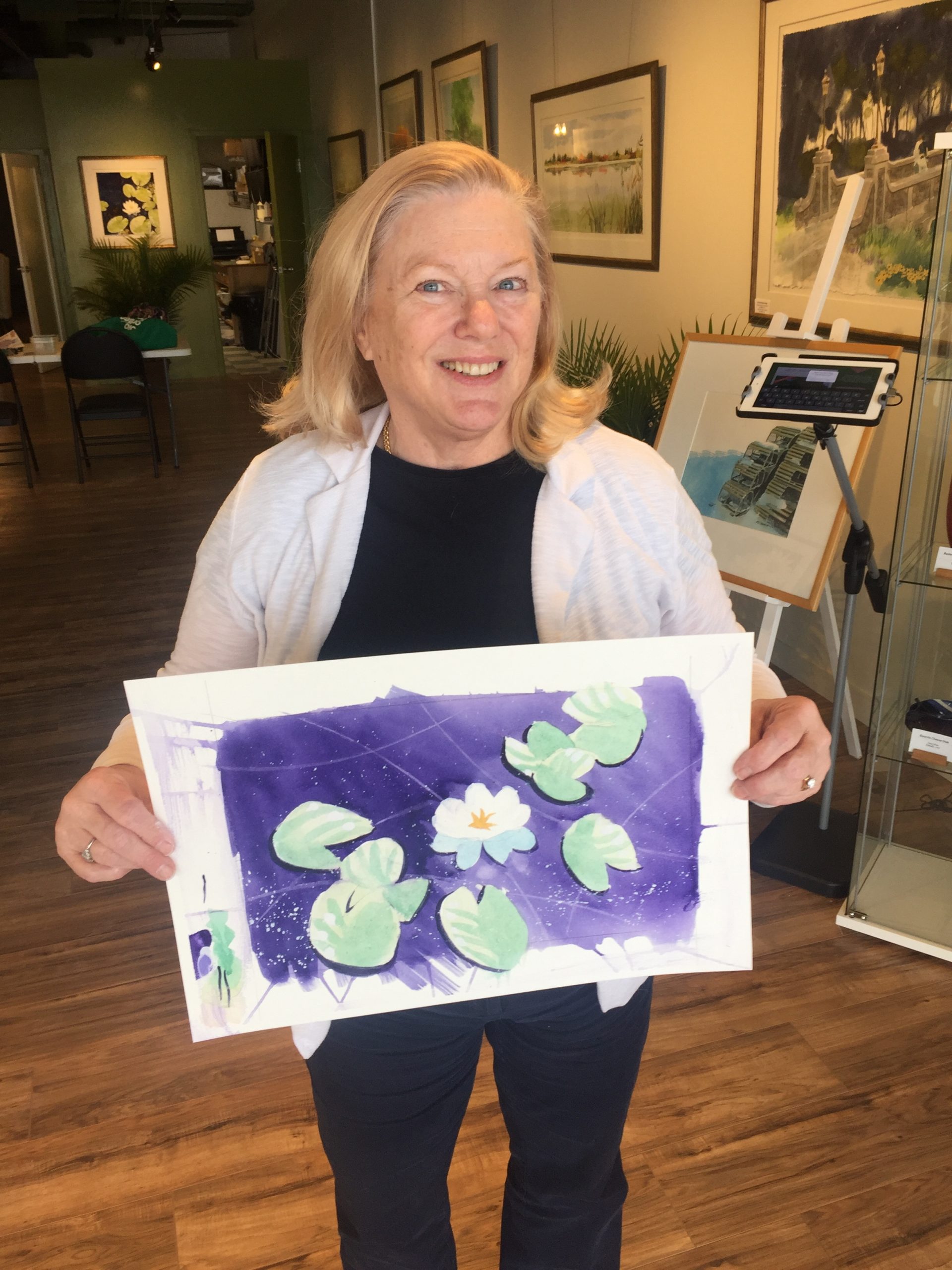
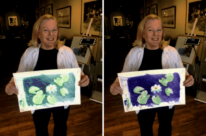
Be bold in your choice of palettes
In the paintings shown above, you’ll notice how the picture on the left the water is painted in a traditional palette, (pea green.)
The painting on the right uses a purple palette. The result is a more ambitious painting. In no way does it seem wrong. But it is striking.
It’s those bold moves that brings a painting to life. Nature does a pretty good job colouring the world around us. It’s our responsibility as artists to show our interpretation of that world. To address this challenge, change the palette to your favourite colours next time you sit down to paint. You’ll immediately see what I mean.
Share This Article
Choose Your Platform: Facebook Twitter Google Plus Linkedin